CSS Flexible Box Layout
This complete guide explains everything about flexbox, focusing on all the different possible properties

I am talented and motivated individual who has completed a Master of Computer Applications (MCA) degree and is now pursuing a career in full-stack web development. With a passion for technology and a desire to innovate, I am constantly seeking new challenges and opportunities to enhance my skills and stay at the forefront in Tech field.
what is Flexbox ?
Flexbox is a one dimensional layout model. Using flexbox, we can structure our webpage in an easier way. Flexbox is very helpful in making our web page more responsive.
.container{
    background-color: rgb(230, 218, 231);
    height: 400px;
    width: 900px;

    display: flex;  //applying flexbox
}
Our first step in flexbox is to provide flexbox properties {display:flex} always give to parent box. people make most common mistake to give {display:flex} to child.
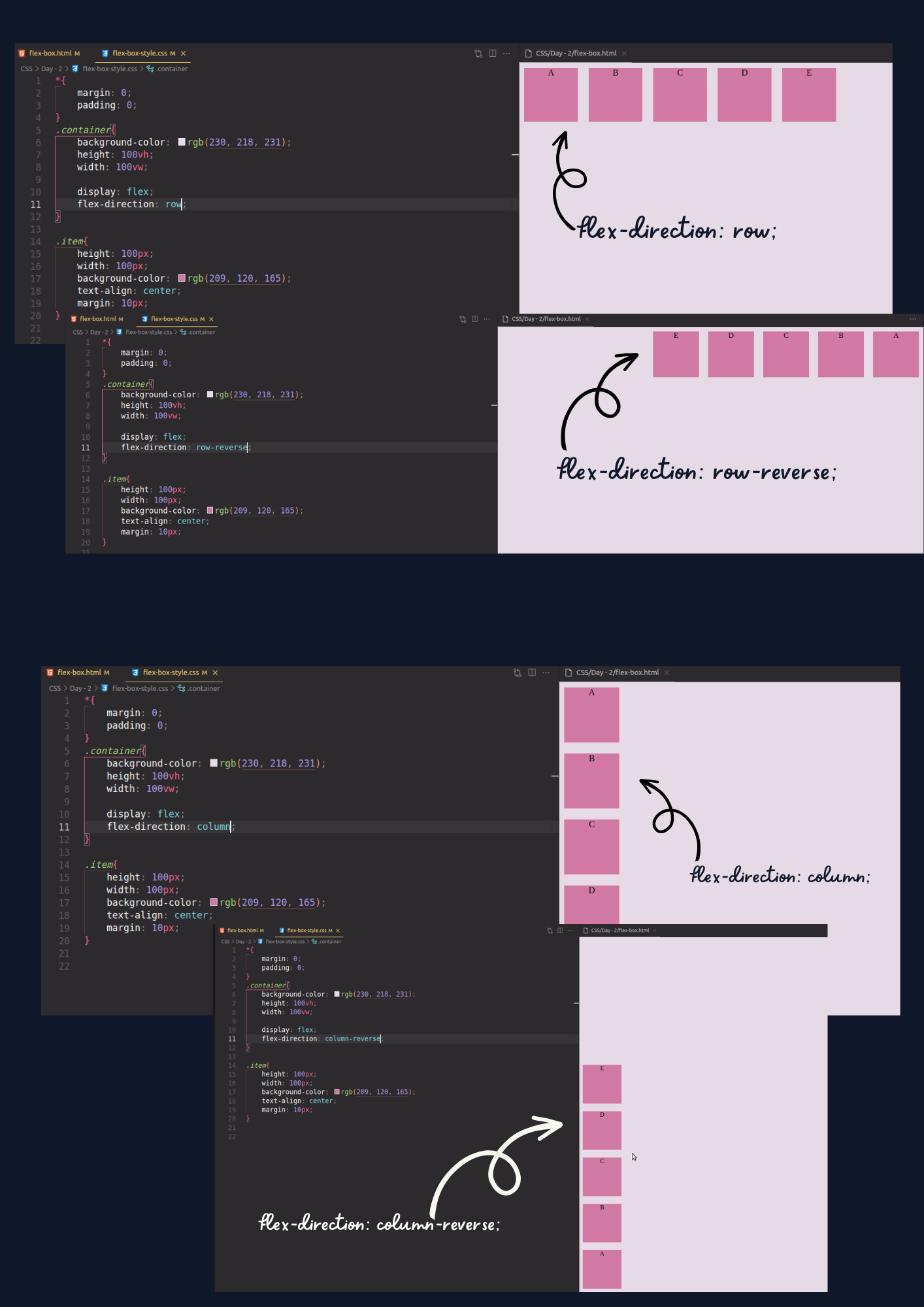
flex-direction
Using flex direction we can establishes our container either horizontally or vertically.
flex-direction:row; default (All children will be Horizontally)
flex-direction:row-reverse; (All children will be Horizontally but in reverse)
flex-direction:column; (All children will be Vertically)
flex-direction:column-reverse; (All children will be Vertically but in reverse)
flex-wrap
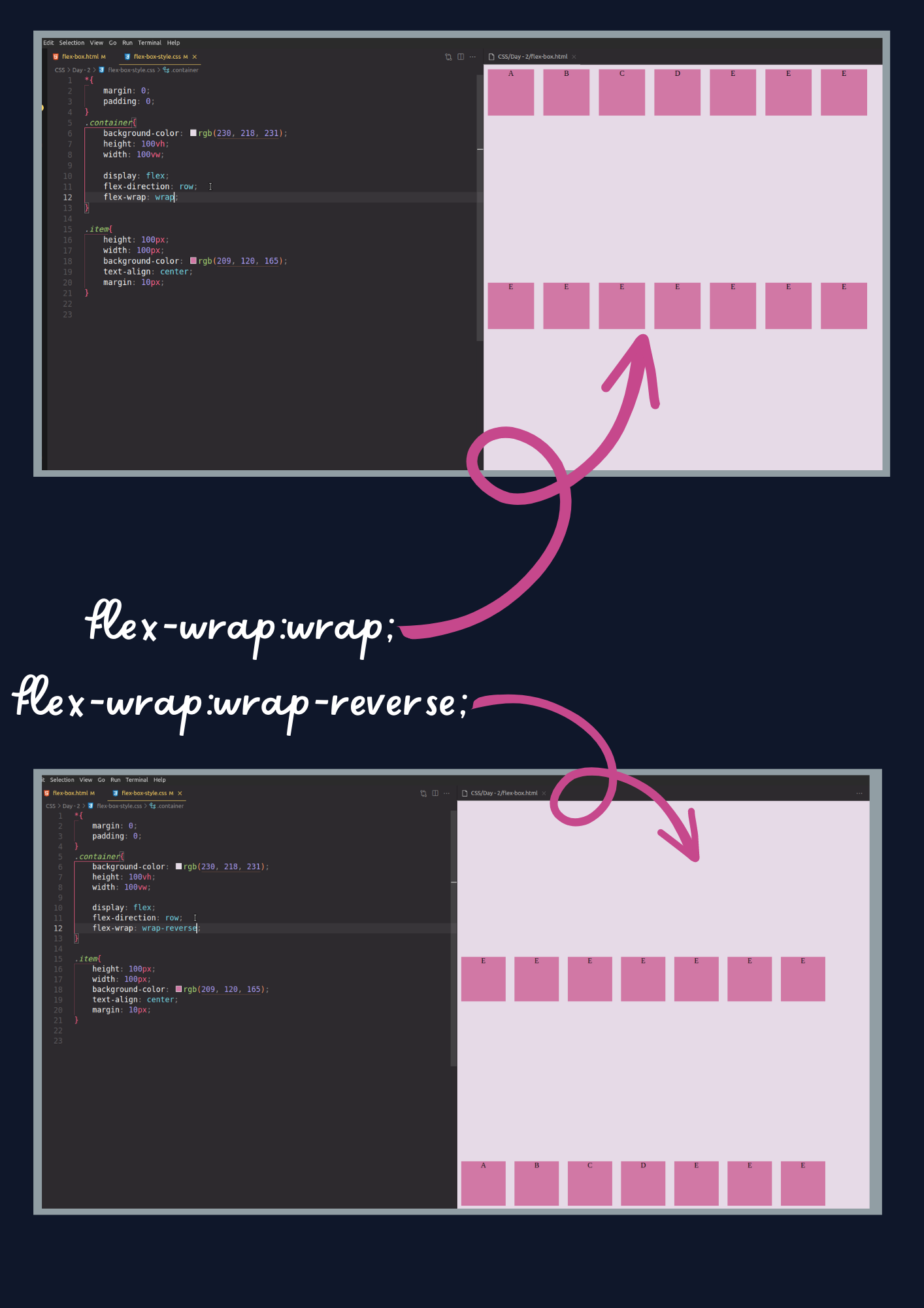
When we do not use flex wrap, all children try to fit in one line flex wrap, wrap according to their size.
flex-wrap:nowrap; default (All in one line).
flex-wrap:wrap; (wrap them according to their size).
flex-wrap-wrap-reverse; (wrap but in reverse order).
justify-content
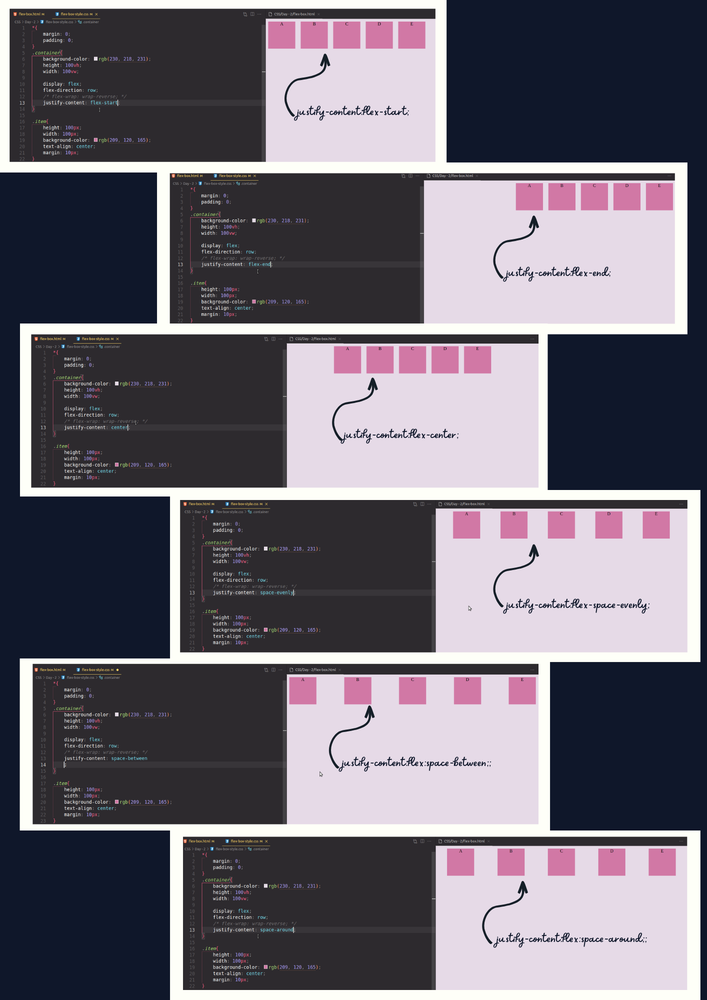
how the browser distributes space between and around content items along the main-axis of a flex container. justify-content distributes space horizontally.
justify-content:flex-start; (default) (All item start from start)
justify-content:flex-end; (All item go to end);
justify-content:center; (All item go to center)
justify-content:space-between;
justify-content:space-around;
justify-content:space-evenly;
align-items
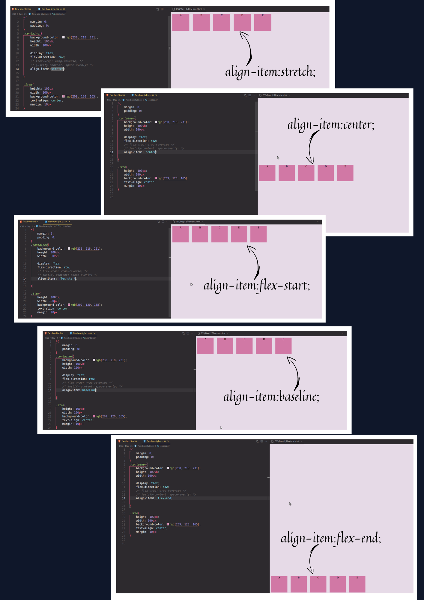
how the browser distributes space between and around content items along the cross-axis of a flex container. align item distributes space vertically.
align-item:stretch; (default) (stretch to fill the container)
align-item:flex-start; (place item at start)
align-item:flex-end; (place item at end)
align-item:center; (place item in center)
align-item:baseline; (place all item at baseline)
order
Using order, we can move the particular box by default the order is 0.
.item {
  order: 5; /* default is 0 */
}