

What is Grid
Using a grid, we can style two dimensions of any container items grid works on two dimensional rows and columns.
Using grid we can layout our website very easily.
.container {
  display: grid;
}
Grid is always applying on parent container than all child of container will affect.
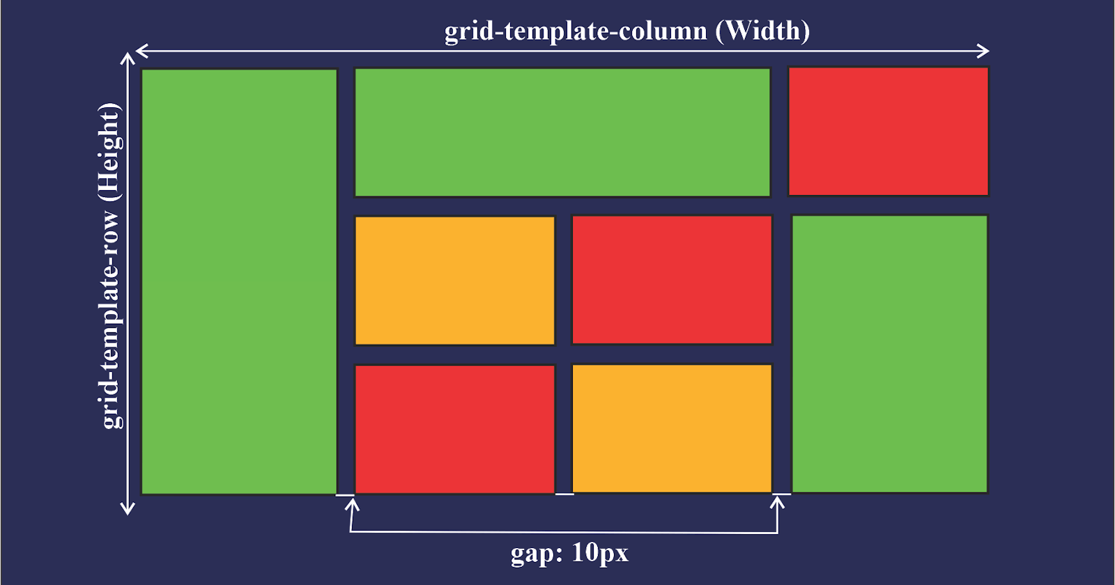
grid-template-columns
grid-template-rows
Using grid-template-columns and grid-template-rows we can assign rows and columns to a container we have to provide the size of rows and columns. We can give any size format like px, rem, fr etc.
.grid-container {
    display: grid;
    grid-template-rows: 120px 120px 120px;
    grid-template-columns: 120px 120px 120px;
    height: 800px;
    width: 800px;
    background-color: rgba(91, 133, 177, 0.151);
}
grid-template-areas
Repeating the name of a grid area causes the content to span those cells. A period signifies an empty cell
.grid-container {
    display: grid;
    grid-template-rows: auto;
    grid-template-columns: 120px 120px 120px 120px;
    grid-template-areas:
    "head head head head"
    "main main main main"
    "side . . ."
    "footer footer footer"
    ;
    height: 800px;
    width: 800px;
    background-color: rgba(91, 133, 177, 0.151);
}

.grid-item {

    height: 100px;
    width: 100px;
    background-color: #5B84B1FF;
    border: 1px solid black;
    margin: 10px;
}

.A{
    grid-area: head;
}
.B{
    grid-area: main;
}
.C{
    grid-area: side;
}
.D{
    grid-area: footer;
}
##column-gap
##row-gap
using column and row gap we can give gap between rows and columns.
.grid-container {
    display: grid;
    grid-template-rows: 120px 120px 120px;
    grid-template-columns: 120px 120px 120px;
    height: 800px;
    width: 800px;
    background-color: rgba(91, 133, 177, 0.151);
    column-gap: 30px;
    row-gap: 50px;
}
justify-items
Aligns grid items along the inline (row) axis (as opposed to align-items which aligns along the block (column) axis).
.grid-container {
    display: grid;
    grid-template-rows: 120px 120px 120px;
    grid-template-columns: 120px 120px 120px;
    justify-items: start;
    justify-items: end;
    justify-items: center;
    justify-items: stretch;
    height: 800px;
    width: 800px;
    background-color: rgba(91, 133, 177, 0.151);
}
align-items
Aligns grid items along the block (column) axis (as opposed to justify-items which aligns along the inline (row) axis).
.grid-container {
    display: grid;
    grid-template-rows: 120px 120px 120px;
    grid-template-columns: 120px 120px 120px;
    align-items: flex-end;
    align-items: flex-end;
    align-items: baseline;
    align-items: center;
    height: 800px;
    width: 800px;
    background-color: rgba(91, 133, 177, 0.151);
}
justify-content
justify content use to move all rows and columns horizontally we can also give them space and move start end and center.
.grid-container {
    display: grid;
    grid-template-rows: 120px 120px 120px;
    grid-template-columns: 120px 120px 120px;
    justify-content: center;
    justify-content: end;
    justify-content: start;
    justify-content: space-around;
    justify-content: space-between;
    justify-content: space-evenly;
    height: 800px;
    width: 800px;
    background-color: rgba(91, 133, 177, 0.151);
}
grid-column-start
grid-column-end
grid-row-start
grid-row-end
All the above are child properties we can give these properties to child to expand particular item in row-wise or either column-wise
.A{
    /* grid-row-start: 1;
    grid-row-end: 3;
    grid-column-start: 1;
    grid-column-end: 3; */

    /* shorthand property */

    /* grid-row: 1/3;
    grid-column: 1/3; */

    /* another shorthand property */
    grid-area: 1/1/3/3;
}