

Table of contents
What is a Media Query?
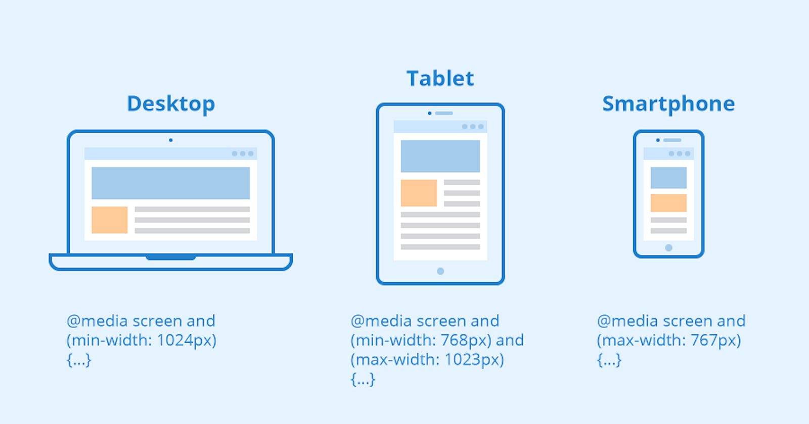
Using CSS media queries, we can make our web more responsive. When we open a website on different devices, the layout should be different. Using media queries, we can solve these issues and make the web responsive.
@media screen and (min-width: 600px) {
  .element {
    display:flex;
    flex-direction:column;
    justify-content:center;
  }
}
Use these properties whenever the minimum width of a web page is 600 pixels.
value ranges
@media (min-width: 600px) and (max-width: 1100px) {
  .container {
    background-color: purple;
  }
}
The container class should apply these properties whenever our web page is between 600px and 1100px wide.